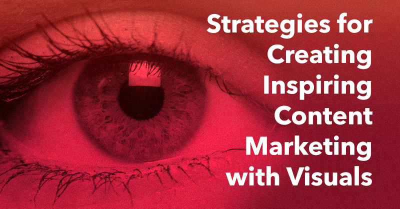
Human beings are visual by nature. Over thirty percent of our brain-power is dedicated to processing visual input and our optical abilities go far beyond simply “seeing” what is in front of us.
The real power of our most valuable sense is how heavily it factors into decision-making. We actively interpret and evaluate nearly everything through the lens of the visual.
There are very few choices we make that aren’t influenced by what we see, and it is hard to overstate the impact that great visuals can have on just about any choice.
Bearing all of this in mind, it seems like a no-brainer that striking visuals should be a top priority for any marketing effort (after all, what you’re trying to do is sway people’s decisions), but very often I see that marketers often treat graphics as a last-second addition that is not considered all too important.
High-quality visuals are integral to any content marketing effort and this article will share some insight and strategic advice for incorporating amazing imagery into your content.
Create a Visual Language
When you are first starting any type of content marketing effort, the first thing to do is to understand your overall mission.
Once you understand why you are doing what you are, you can begin to define your point-of-view and the unique perspective you want to articulate with your work.
In reference to writing, this is often called your brand or publication’s “voice.”
In the editorial world, the unique voice of a publication is ruthlessly guarded and enforced. This is no accident either. There’s a reason you can tell when you are reading a New Yorker article right a way, and the same can be said of The New York Post.
If the voice is the core identifying factor of the written word, then a visual language is it’s graphical counterpart.
A visual language (or visual identity), is so much more than just a logo. Whether you’re a brand or publication (more and more, the line between the two is blurring) a visual identity serves to reinforce their editorial voice and can aid tremendously in branding effectively.
The best part of a visual identity is that a rudimentary one can be created fairly easily, in fact the only requirements are that graphics are incorporated and that you maintain consistency.
So long as your visuals and voice align, the actual graphics don’t have to be all that sophisticated. That’s because they are never really meant to stand alone (although the very best certainly can). Rather, they are simply meant to serve as an identifying mark of your work.
One of the most legendary visual identities ever created was Saul Bass’ work for Bell Telephone. Watching the presentation, though, you see that the elements involved were actually incredibly simple.
Bass incorporated a pared down symbol, a basic but strong typeface, and a basic visual element (stripes) and by simply being deliberate and consistent in his usage he created one of the most valuable and memorable visual identities of all time.
Be Systematic in Your Approach
The most important part of crafting a visual identity is consistency. Even very simple elements, repeated diligently, can come off as professional; whereas beautiful, but scattershot graphics will not accomplish much of anything.
In addition, since content marketing requires keeping up a fairly sustained pace, you need to make sure you can create graphics quickly and accurately enough to help accomplish a strong visual identity.
All of this creates a strong case for developing a systematic approach to creating graphics. This is especially true if a graphic designer will not always be on hand for every piece of visual material that needs to be created.
A brilliant example of such a systematic approach was one developed by Natasha Jen of the famous design firm Pentagram for their client US Office.
She new that her client would have to make reams of materials with graphic components using limited skills and design resources. That is why she developed a plug-and-play system using simple visual elements and basic fonts that could accommodate many graphic needs.
A very similar approach was put in to practice by the legendary designer Massimo Vignelli for the U.S. National Park system.
Like Jen, Vignelli understood that park rangers would have to constantly update the maps, and that if visual consistency were to be maintained, a highly regimented system would need to be developed.
Although systematic thinking and creative thinking are often seen as diametrically opposed, the resultant maps (many from non-designers) turned out to be among the most striking and recognizable pieces of graphic work of the era.
This systematic approach is one that I’ve tried to implement throughout my own work, and the result is one I’ve been quite pleased with.
While I have a designer who helps with my more involved graphical work, many of the smaller day-to-day tasks are left to me. Especially when it came to running #InsiderChat (which is on hiatus until 2016), there were many times where I needed to quickly create many graphics.
With this unique challenge in mind, my designer and I developed a templated system that would be flexible enough for me to use interchangeably, but that would still be visually interesting and contribute to the Honigman Media visual identity.
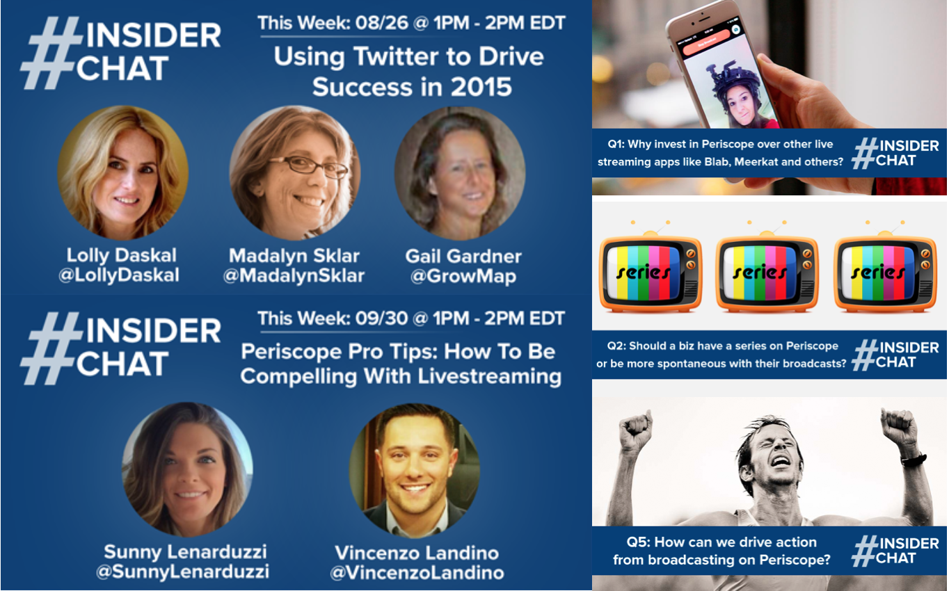
Utilizing this system allowed me to increase the visibility and scale of my Twitter chat, which in turn helped my overall content marketing efforts.
The beauty of a system like this is that it converts nearly any member of your team into a potential contributor to your visual identity and once the initial work is put into place the returns can last for a very long time.
Integrate Visual Identity Thoroughly
One of the most common mistakes content marketers make in their approach to incorporating visuals is that they treat them like window-dressings. More of a nice-to-have than a must-have.
This is a recipe for underwhelming visuals and a lot of wasted effort and expense.
Even if you achieve a consistent, pitch-perfect visual identity, sprinkling it on top of your content will not achieve the desired effect.
For an example of great incorporation of visual identity into content marketing, take a look at a blog like that of SumAll, one of my clients.
Beyond the fact that the actual website is beautifully designed, the incorporation of images into the content itself is what really makes the experience memorable.
In the graphic below see how the visual aids not only help get the message of the piece across, but also link up to SumAll’s broader visual identity.

On their own, these elements are nice but nothing all too special. However, when taken as a whole and paired with the high-quality content that SumAll produces, the effect creates something entirely new.
Create “Gestalt” Content
One final note to end on (that might seem like an odd tangent, but bear with me) are the famously misquoted words of the Gestalt psychologist, Kurt Koffka.
The whole is other than the sum of its parts.
Nearly everyone replaces “other” with “greater,” but this is not what Koffka meant.
The bedrock belief of the Gestalt approach to perception was that we actively group and categorize elements from our chaotic world in a way we can easily make sense of and use to make better decisions.
When we see a chair, there are various sloping planes of wood, and screws and bolts; however, we recognize the overall form and the chair itself emerges as something wholly new from its constituent components.
The world of content marketing is bombarding your customers with a chaotic jumble of messaging and materials, but the only thing they are truly looking for is insight and utility.
By actively incorporating a strong, consistent and recognizable visual element throughout your content you will transform the chaotic components of your efforts into something else entirely.
What will emerge if you succeed in incorporating compelling visuals will be something that catches your audience’s eye and makes them want to click through.